Labor Day Nitty Gritty
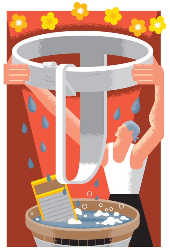
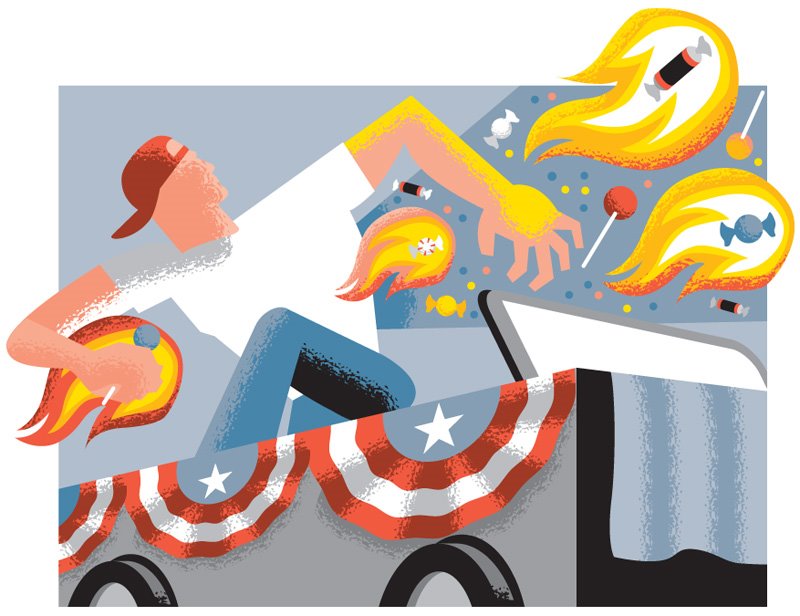 If you find yourself nearby a St. Louis Post-Dispatch on Thursday the 31st, check out the Get Out section to see a bunch of illustrations I did, including the cover. Reporter (and pal) Diane Toroian Keaggy wrote a bunch of funny descriptions of Labor Day events around town this weekend, specifically regarding the real men and women whose hard behind-the-scenes work manufacture good times for the rest of us. I drew them in kind of a Labor Propaganda / WPA poster mode, both to reflect the origins of Labor Day and in fear that my normal cartoonier style would be overkill alongside Diane's funny character profiles. The one at the top of this post is for an unsung hero of the St. Louis Labor Day Parade, and here are ones for the Fall Festival of Art and the Japanese Festival at the Botanical Gardens, which will feature displays of Sumo Wrestling.
 I love the crisp shapes and interlocking 2-D "clockwork" compositions of those old WPA posters, but also the dramatic lighting and textured shading. Ideally, I would've actually painted my illustrations also - especially to to get those kind of textures - but given the mechanical concerns of newsprint reproduction (and the practical concerns of newspaper deadlines) I decided to suck it up and give it my best shot using vectors (warning: shop talk ahead!). I've experimented in the past with achieving a gritty blend using series of dots, like here:
 But that still feels too digital. This time I tried creating a custom "pattern brush" tile using more jagged organic shapes, like charcoal on a toothed paper might create:
 It still looks kinda crummy up-close, but looks okay in print. If anybody out there has better suggestions on how to create this effect, short of actually using scanned or pixel-based textures (my antique computer can't handle humungous file sizes), give me a holler. Happy Labor Day!
posted by Dan Z. at 10:36 PM
![]()


5 Comments:
hey dan,
i saw the get out section. wonderful illustrations, man, you definitely have the magic touch!
Dan, an illustrator friend of mine has had luck bring his vector art into Painter (not a huge fan of Painter, myself, but he's able to make it work really well). He's pretty good at getting a painterly/textured look. But at some point you have to leave vector and go pixel.
Noah Jones: http://www.noahzjones.com
Great stuff, by the way! Your solution looks really clever. Shame I can't see it in print.
Awesome stuff! I only every really do vector drawings for my girlfriend's myspace page, but I can't wait to try copying this technique sometime. The WPA was associated with some brilliant art, and Ben Shahn is tops for me. I'm really glad I found your blog because I love your work and I haven't had a chance to tell you that since APE about five years ago. Keep it up!
Yep going vector to pixel works. I find getting the right combination of filters can work which means duplicating layers, adding filter/s then lowering opacity for subtler effects.
Once you get the right combo going you can save it in the actions palette.
Also check out steve macks site http://spotillustration.com/
he creates some wonderful vector textures, but he does this by using his own program modifications...
What a great idea. Thank for sharing. I love this.
Post a Comment
<< Home