Frontier Yuletide
 Merry Xmas!
posted by Dan Z. at 12:23 AM
6 comments
![]()
Illustrations, Comics, Diagrams, Paintings, Maps and Secret Codes, affixed to the hidden plywood wall of a backyard fort with masking tape.
 Here's a pile of stuff I generated while working on a recent illustration. It might give you a window into my working process. You could either look at this or come over to my actual window. The drawing was for an annual event put on by Downtown St. Louis shopping association called Festivus. Below: spec's doodled in my lined sketchbook. I am jealous of people who can keep nice sketchbook, because all of mine are filled with production notes, long division, and things to look up on wikipedia once I get home from White Castle.
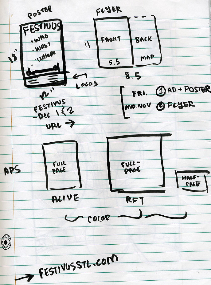 And here's the first idea I had, focussing naturally on the "airing of grievances (via radio)" and the "feats of strength (via greased-up armwrestling)":
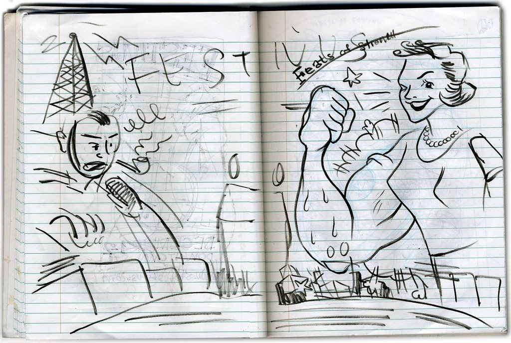 Here are some tighter thumbnails, including more stuff that would attempt to describe what the actual event entailed (shopping, holiday merriment):
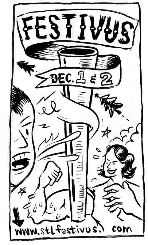
 I got some feedback, gathered some more reference, and drew this revised sketch at the bowling alley. I mixed and matched elements from the thumbnails and worked out a palette when I got home:
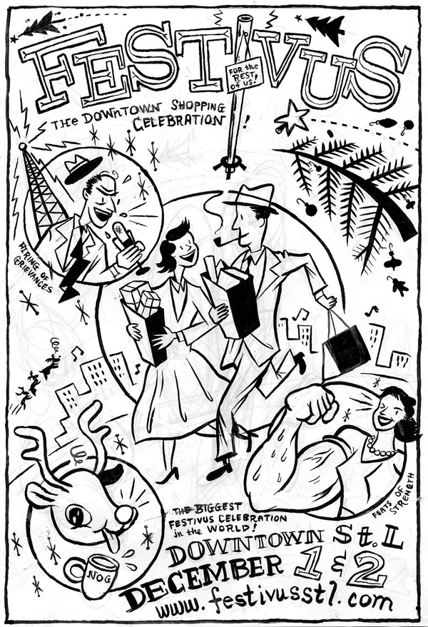
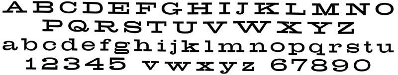
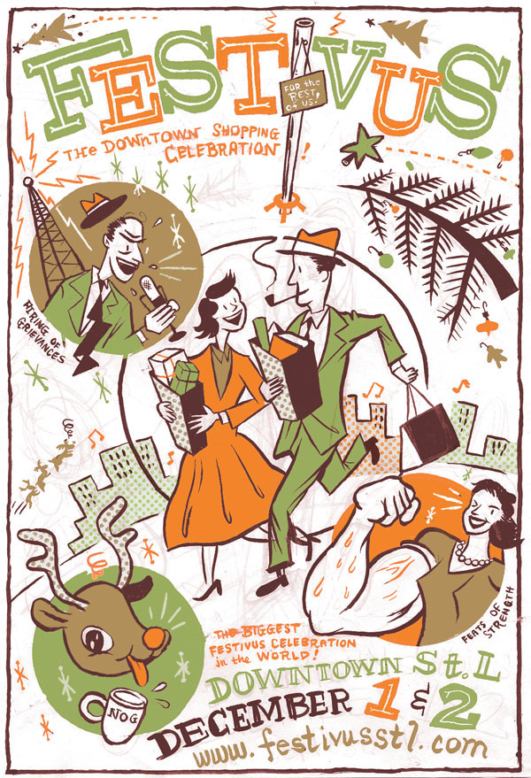 Once I got the go-ahead, I started the final drawing by constructing the shapes of color - which I wanted to have an old-fashioned, mechanically flat look - with vectors in Illustrator. I also laid out the letters, pulled from a font called 'Breite' which I scanned from an old book of decorative carnival typefaces...
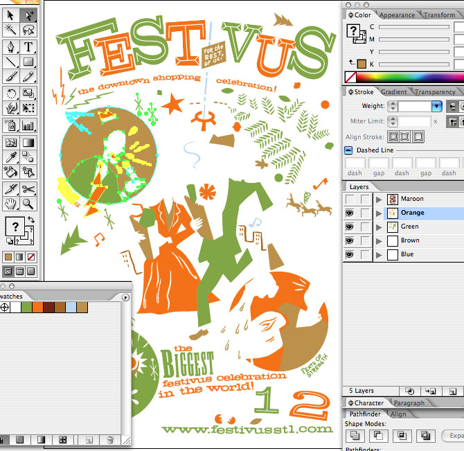
 Then I did an ink drawing, tracing the vector shapes on a light-box, for the line-art parts...
 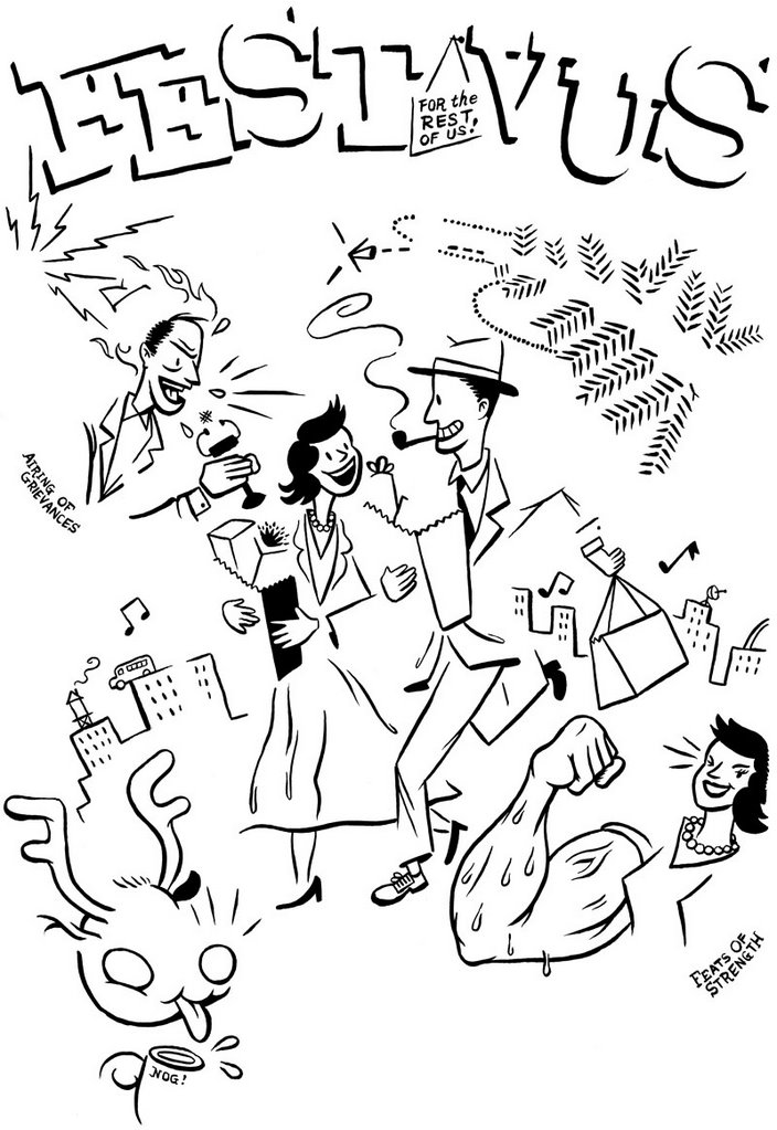 I wanted to do an overall background color behind everything, but due to the fact that this these posters were gonna be xeroxed and a full-bleed wasn't possible, I decided a rough, dry-brushed style edge was the way to go. Having tried to artificially simulate this kind of texture in the past, this time I decided to get my hands dirty (literally) and break out a little stub of charcoal found at the bottom of my art supply tacklebox:
 Having already thrown everything but the kitchen sink at this illustration I decided to do one last thing in photoshop and add a layer of distortion, suggesting an underinked silkscreen or letterpress. Fun Fact: I got this distrissed texture by scanning in the inside back cover of a beat-up old copy of a Milt Caniff's Male Call.
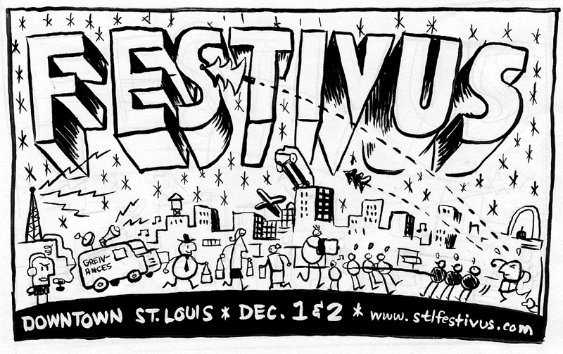
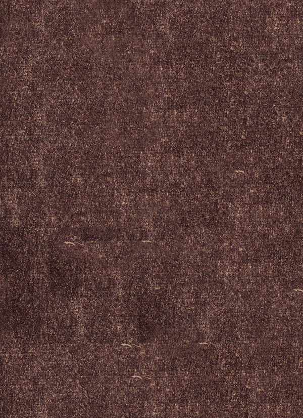 Then I combined everything into a crazy frankenstein file which made me wish my computer was faster. I would get into the Photoshop nitty-gritty but I'm boring myself just thinking about it. Let's all go to the batting cages instead. Anyway, here's the final:
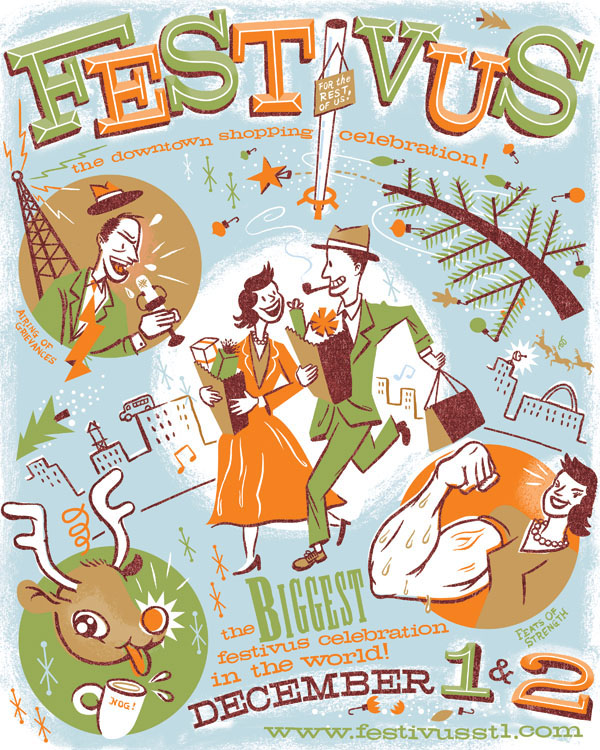
posted by Dan Z. at 7:08 PM
23 comments
![]()


