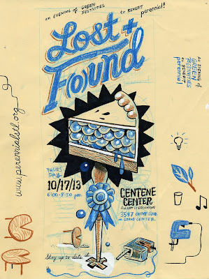
Lost + F(ound) 2013! Blueberry Pie!
Getting excited for tonight's Lost + F(o)und, the fun(d)raiser for St. Louis' own dumpster-diving, upcycling, furniture/art/craft making gang Perennial. Here's some nitty-gritty behind the poster I printed for it. Initial ideas:
In past years I've focused on the 'state fair' and 'junk drawer' nature of Lost + F(o)und; this year I wanted to really play up the PIE (Perennial puts together an amazing annual smorgasbord of pies at the event). At first I thought about showing a slice of pie being constructed out of reclaimed wood:
Maybe an exploded diagram kinda thing?
Or maybe on an avant-garde architectural shelf?
At some point I realized a pie made out of wood planks was not very appetizing, so started thinking about just depicting an actual piece of blue-ribbon pie. I just realized that the first three letters of 'piece' is 'pie'!
I started to get into the idea of a slice of piece being cut out of an entire table with a jigsaw and turning that into a fancy pedestal.
Here's a tighter sketch:
I knew I wanted the whole thing to look like it was printed on a chunk of plywood; here's the final assembled sketch:
After getting approval on that idea, I went into final inks. Here's the lineart (notice I didn't bother drawing an 'o' in F( )und):
And here's a chunk of wood I found in my basement and made a hi-res. scan of:
Color adjusted:
To work with my lo-fi silkscreen process, I had to make a chunkier halftone version of the woodgrain to work as a single color. I went with a vertical line style of halftone in photoshop to mimic the fine grain of the wood:
Meanwhile I was mixing up and testing my 3 inks (dark brown, white, semi-transparent blueberry blue), on the paper I would use (Canson Mi-Tientes Hemp pastel paper):
Final vector art with the woodgrain half-tone dropped behind everything:
All 3 colors separated, printed on acetate and squeezed side-by-side on one frame, on the exposure table:
The screen, ready to squeegee ink through:
Final print:


