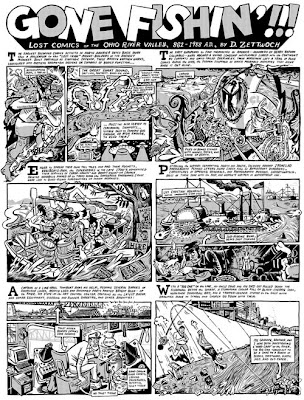
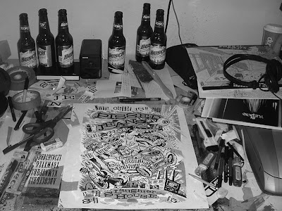
Pick up the new issue of
COMICS COMICS, the hottest tabloid newspaper of comics art and criticism, for a new gigantic one-pager by yours truly. It is reprinted above at a thumbnail size. (Don't try to actually read it or your eyeballs won't speak to you for a while).
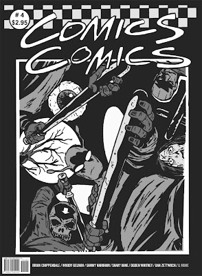
You can get your own copy of the awesome oversized magazine from the
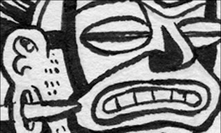
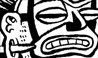
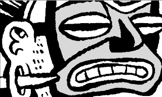
publisher. Here is a sample panel of my strip, which tells the secret history of comics-related activities along the Ohio River going back 1200 years:
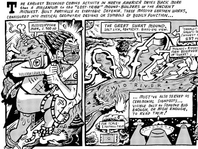
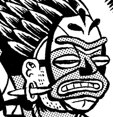
You may have noticed that I'm using a black dot
halftone look for this strip (as well as all my recent
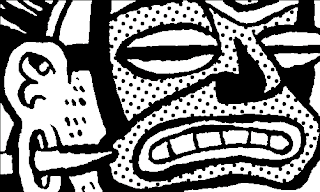
Amazing Facts & Beyond strips). From a distance it looks like there are areas of gray shading, but when you look closely it actually looks like this:
The reason you would want to use this process is to have complete control over how your final printed art looks. Although advances in digital printing technology have improved handling of continuous gray tones, with this method you know precisely how "dark" the grays in your art will print. I've gotten enough questions about my personal process for home-made halftoning to want to type up a quick tutorial. Here goes:
I reckon I'm a little bit too young to have used actual store bought
halftone paper, like the legendary (and out of business) Zip-a-Tone, which was clear plastic adhesive sheets with black dots printed on them in a variety of spacings. For a while though, I made my own "poor man's Zip-a-Tone" out of laserjet transparencies and paste them right on my inked art with glue-sticks (see above). This was punk but messy and time-consuming to I moved to "thinking man's Zip-a-Tone" which involves a computer ("rich man's Zip-a-Tone?"). Here's my process:
1) Scan my lineart drawing at 600 DPI grayscale. This is a good time to tell youngsters never to scan in "lineart" or "bitmap" mode. You and your graphics software will do a much better job at fine-tuning the gray edges of your lines than leaving it to your the robot inside your scanner.
2) Play with the levels to make the ink look black and the paper look white. Do all the clean-ups, tweaks, etc. to the art, change the image size to the final printed size.
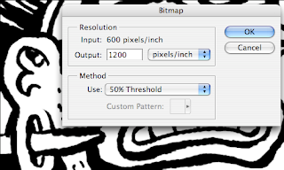
3) Convert the file to 1200 DPI bitmap, with the setting to 50% threshold. You do this because you ultimately want your lineart to be totally crisp and not halftoned.
4) Convert the file back to grayscale leaving it at 1200 DPI.
5) Go through and add the gray tones with a 20% K. You could do it darker if you wanted more dense dots. (no need to do it on a separate layer, just use the paint bucket or a brush set to 'darken' or whatever. All you should have a white pixels, black pixels, and the gray tone pixels)
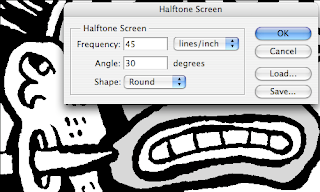
6) Convert it to back to 1200 DPI bitmap, with the 'haftone screen' settings set like this.
(you can mess around with those settings too, if you want your dots to be bigger or stupid shapes or whatever).
Then you are done!
The main thing is that your art is thresholded before you start adding grays. Otherwise when you go to turn the whole thing to halftone your art will get a tiny bit fuzzy around the edges.
To leave you with another piece of halftoned art I did recently, here's a tough t-shirt design I hooked my mom and her students up with. I will do a tutorial on Illustrator Barb Wire Pattern Brushes another time.
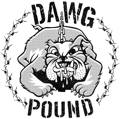
Go Louisville Male High School Bulldogs!
 Continuing my theme of giant invaders conquering the St. Louis skyline, I made a print for an art show opening this week at Star Clipper. The design is above. The prints themselves are pretty large and fluorescently 2-colored so they may not photograph well but I'll try. In the meantime, here's the sketch:
 It should be a neat show featuring new works by lots of local artists united by love for our favorite comics shoppe. Here is a sneak peek at the inspiration for my pieces, a masterwork at least 20 years in the making. And here is the famous (and still available for purchase!) tote bag I designed a while back.
 See you there Friday night!?


